

This section defines the placement of elements on the items that comprise a stationery system. Note that the LaGrange College logo and wordmark and text elements appear consistently on each piece. This is to assure that our communications have a similar “look and feel” and are readily recognizable.
The examples in this section are for illustrative purposes only. Please do not rely on the text appearing on the samples (i.e., phone numbers, etc.) for accuracy, as this information may change.
Ordering stationery items
To order LaGrange College stationery items, place your order through the College’s Panther Prints Center.
“Original” letterhead must be used on all mailings to off-campus audiences. Photocopies are not acceptable. Second (and following) sheets for mailed letters must be of the same paper stock as printed first sheets. Order these sheets from the Panther Prints Center.
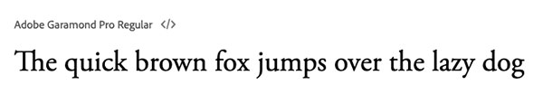
Fonts
The standard font used in the LaGrange College Visual Identity Program is Adobe Garamond. Contact the LaGrange College Marketing and Communications Office for information. Fonts may be ordered at 1-800-833-6687 or www.adobe.com.
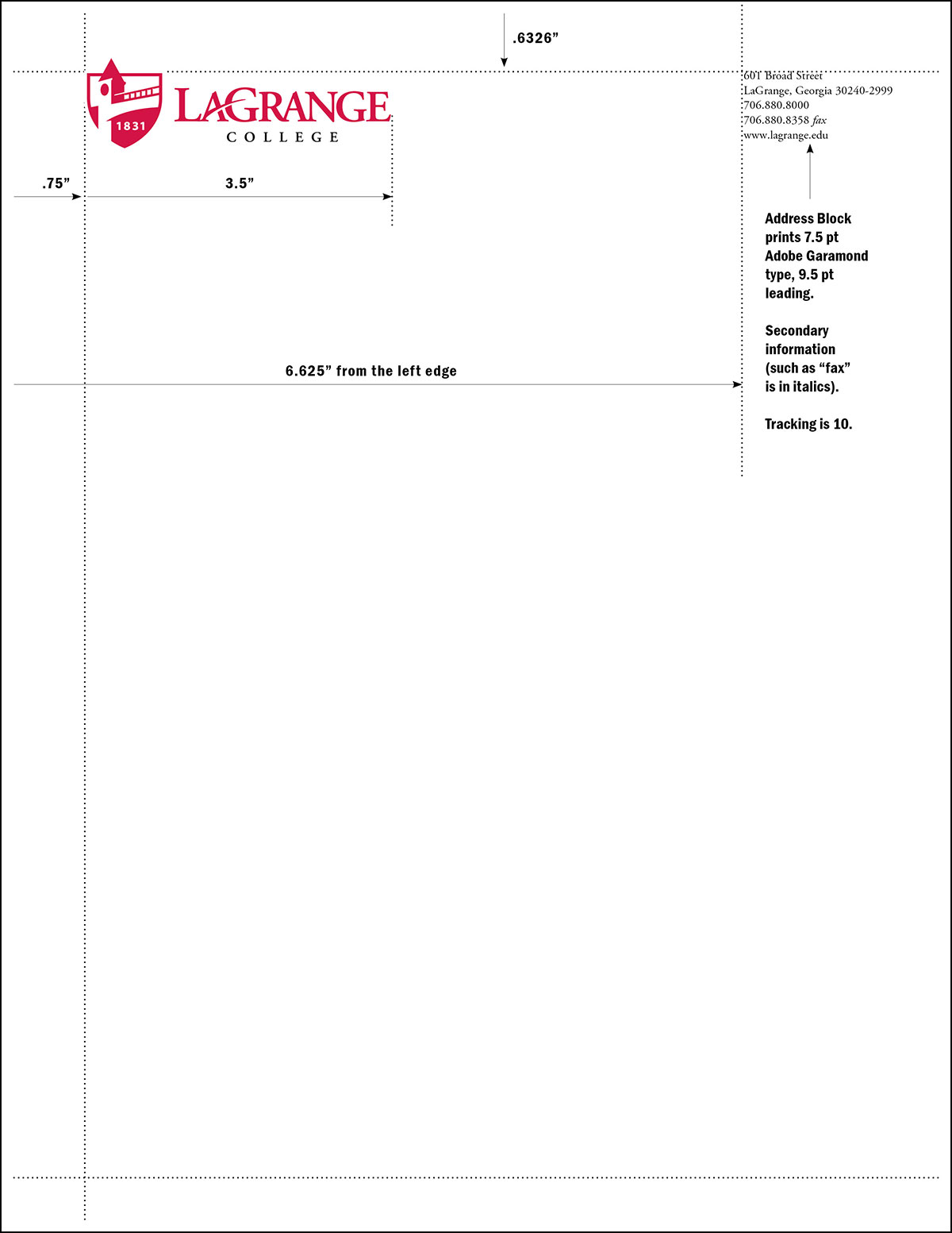
Letterhead - Standard
Even though specific measurements are provided for stationery layout (below), it is preferable to use electronic documents provided by the LaGrange Marketing and Communications Office to maintain consistency. These documents can be found here.
The Red & Black Logo is placed in the upper-left corner, .75” from the left edge and .6326” from the top edge.
As shown above, the logo should measure approximately 3.5” from the left edge of the “L” to the right edge of the “E.”
The address block is placed in the upper-right corner, 6.625” from the left edge and .6236” from the top edge.
Ink Colors
“LaGrange” prints PMS 200 Red. All other text prints PMS Black. To save money on printing the logo will be imprinted in large quantities as a “shell.” Later, specific address blocks will be printed in black, in smaller quantities.
Paper
Neenah® Classic Crest® Smooth, Recycled Bright White, 24# Writing
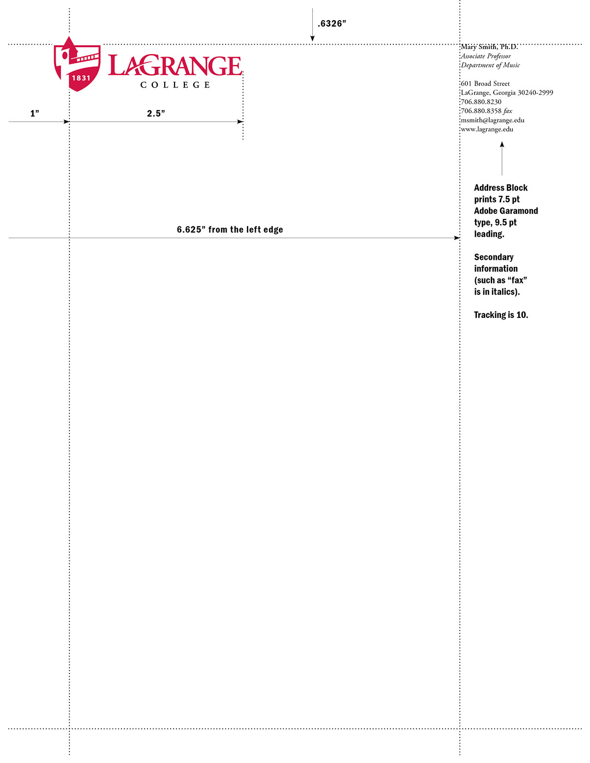
Letterhead - Personal
Same as “Standard” letterhead, but add the Name to the top of the address block. The Name should be set in semibold and “Upper and Lowercase” letters.
The Title should be set in italic on the next line (or two lines, depending on the length of the title), followed by one line space and the remaining address block.
The entire name and address block prints black.
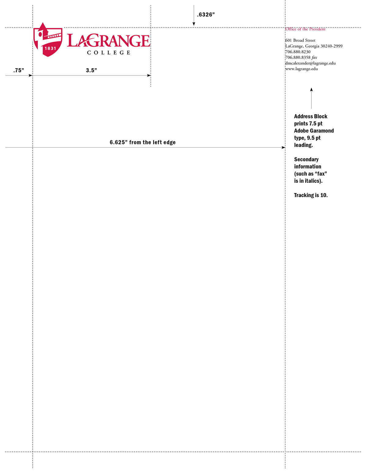
Letterhead - President's
For the President’s letterhead, follow guidelines for “Standard” letterhead, but add the “Office of the President” in PMS 200 Red, one line space above the address block. It should be set in semibold and upper and lowercase letters.
The address block prints black.
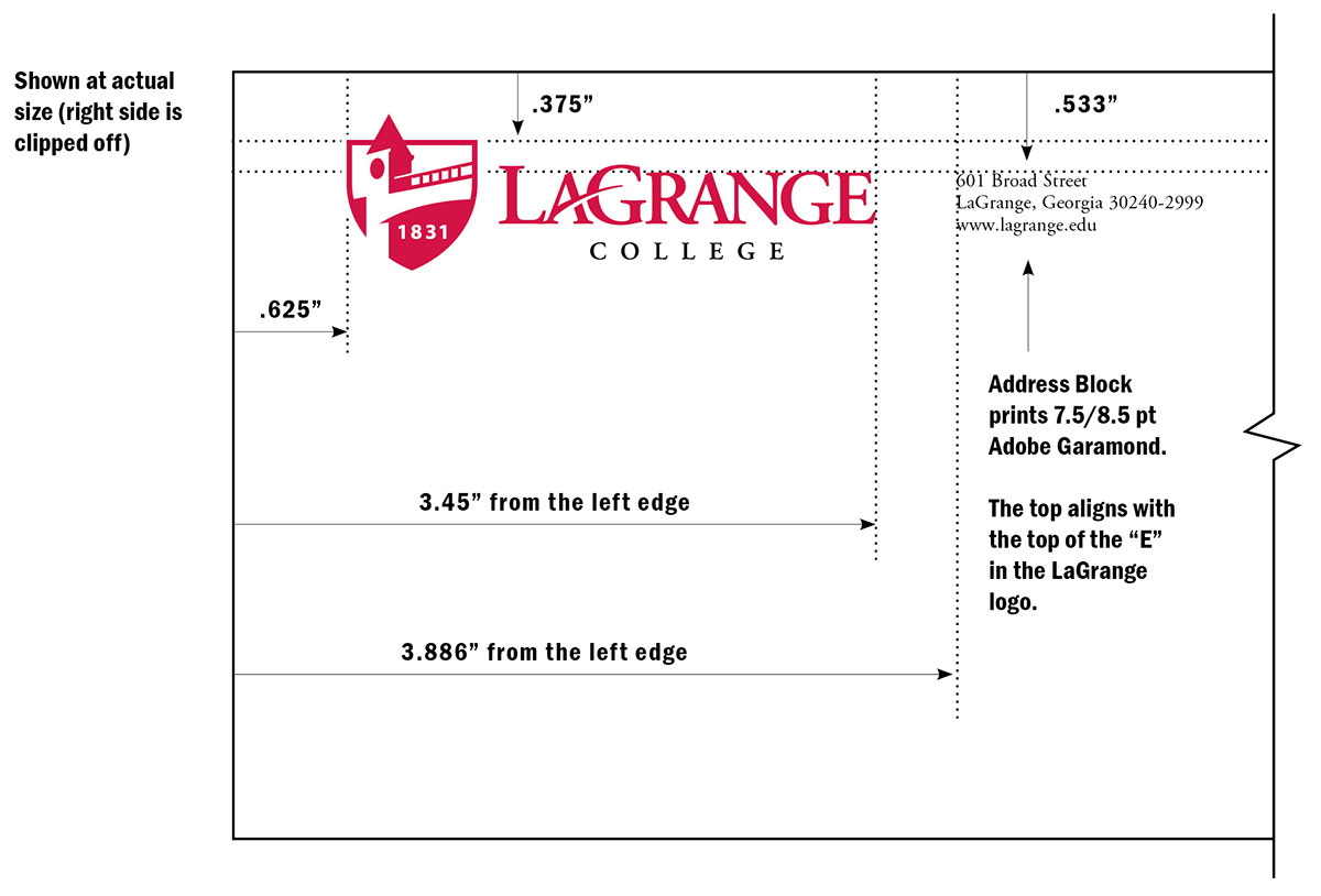
#10 Envelope - Standard
The graphic below illustrates standard placement of identity elements on envelopes. These envelope standards comply with all current U.S. Postal Service (USPS) standards.
The Red & Black Logo is placed in the upper-left corner, .625” from the left edge and .375” from the top edge.
The address block is placed to the right of the logo, 3.886” from the left edge and .533” from the top.
Ink Colors
“LaGrange” prints PMS 200 Red. All other text prints PMS Black. To save money on printing the logo will be imprinted in large quantities as a “shell.” Later, specific address blocks will be printed in black, in smaller quantities.
Paper
Neenah® Classic Crest® Smooth, Recycled Bright White, 24# Writing envelope with a diagonal seam is the preferred envelope stock. For cost savings, a good quality 24# white, #10 envelope with a diagonal seam is acceptable.
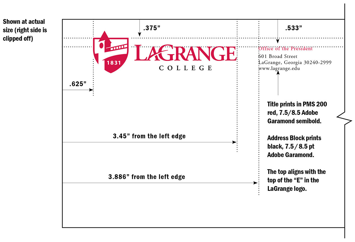
#10 Envelope - President's
The graphic below illustrates standard placement of identity elements on the President’s envelopes. These envelope standards comply with all current U.S. Postal Service (USPS) standards.
The Red & Black Logo is placed in the upper-left corner, .625” from the left edge and .375” from the top edge.
The address block is placed to the right of the logo, 3.886” from the left edge.
Ink Colors
“LaGrange” and “Office of the President” print PMS 200 Red. All other text prints PMS Black.
Paper
Neenah® Classic Crest® Smooth, Recycled Bright White, 24# Writing envelope with a diagonal seam is the preferred envelope stock.
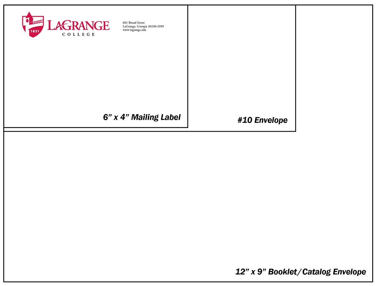
Envelopes and mailing labels
The graphic below illustrates standard placement of elements on envelopes or mailing labels. Regardless of the size, the logotype and address lines should appear in a consistent position from the top and left edges of the piece.
Ink Colors
“LaGrange” prints PMS 200 Red. All other text prints PMS Black.
Paper
Neenah® Classic Crest® Smooth, Recycled Bright White, 24# Writing is the preferred envelope stock. For cost savings, a good quality white envelope, at least 24#, is acceptable.
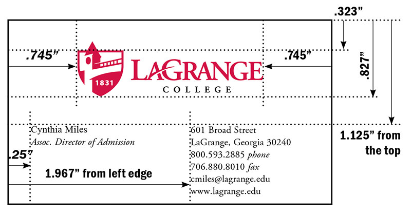
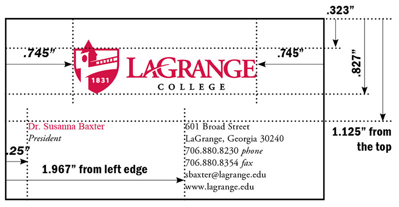
Business cards - Standard
The graphic below illustrates standard placement of identity elements on business cards. It is a standard 3.5” x 2” card. The Red & Black Logo is placed .323” from the top edge and centered from the sides.
The name block is placed .25” from the left edge and 1.125” from the top.
The address block is placed 1.967” from the left edge and 1.125” from the top.
Ink Colors
“LaGrange” prints PMS 200 Red. All other text prints PMS Black. To save money on printing the logo will be imprinted in large quantities as a “shell.” Later, specific address blocks will be printed in black, in smaller quantities.
Paper
Neenah® Classic Crest® Smooth, Recycled Bright White, 80# Cover
The PREFERRED card has only the name and title to the left of the address block. The name is semibold,
and the title is in italics on the next line.
Name and Address Blocks print 7.5/9.5 pt Adobe Garamond. The name is semibold, and the title is in italics. Tracking is 10.
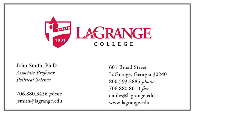
The ALTERNATIVE card has additional information in the left column, following a line space. Only use this option if there is too much information to fit in the address block.
When using the “alternative” option, the first information listed under the title should be the direct phone number, then the e-mail address.
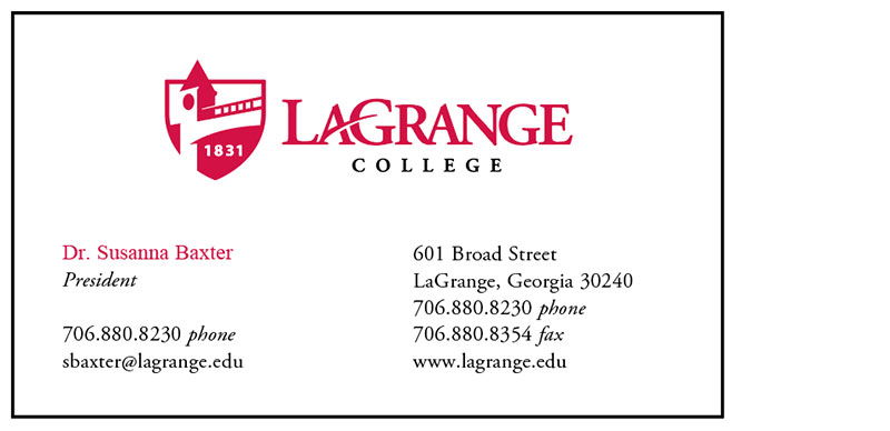
Business cards - President's
The graphic below illustrates standard placement of identity elements on the President’s business cards. It is a standard 3.5” x 2” card. The Red & Black Logo is placed .187” from the top edge and centered from the sides.
The name block is placed .25” from the left edge and 1.125” from the top.
The address block is placed 1.967” from the left edge and 1.125” from the top.
Ink Colors
“LaGrange” and the President’s name prints PMS 200 Red. All other text prints PMS Black.
Paper
Neenah® Classic Crest® Smooth, Recycled Bright White, 80# Cover
The PREFERRED card has only the name and title to the left of the address block. The name is semibold,
and the title is in italics on the next line.
Name and Address Blocks print 7.5/9.5 pt Adobe Garamond. The name is semibold, and the title is in italics. Tracking is 10.
The ALTERNATIVE card has additional information in the left column, following a line space. Only use this option if there is too much information to fit in the address block.
When using the alternative option, the first information listed under the title should be the direct phone number, then the e-mail address.